Lab 2
HTML & CSS: Layouts & Forms
Lab Setup
If you have not already done so, create lab folders
- Create a folder in your user drive (Z:) for storing your course work called
csis390/. - Create a sub-folder in your
csis390folder for storing your lab work, i.e.,csis390/labs. - Create sub-folders for all the labs, i.e.,
lab1, lab2, ..., lab3.
Also, make sure you can view file extensions in Windows
- Click the Start menu
- Type "folder options" in the search and click "Folder Options" when it appears at the top of the Start menu
- A dialog box with the title "Folder Options" will appear. Click the "View" tab at the top of the window
- Click to uncheck the box for "Hide extensions for known file types"
- Click the "OK" button at the bottom of the dialog box
Download Starter Files
Download all the HTML and CSS files in the
lab2 folder
to your own lab2 folder, i.e., csis390/labs/lab2
1. CSS Responsive Layouts
-
Modify the CSS code in
selectors.cssusing Notepad++. -
Open
selector.htmlin Chrome and refresh the web page each time you save your CSS changes. -
Alter the CSS code to make the website title and the main navigation
more compact:

Hints:- Add your css at the end of
selectors.cssto override the existing CSS - Change the text-align of the
headerso it aligns left instead of center - Make the
h1andnavinside theheaderdisplay asinline-block - Make the
ulinside theheaderhave a margin of zero all around so it is as compact as possible - Make the
h1inside theheaderhave left margin of 30px and zero on the other three sides
- Add your css at the end of
-
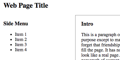
Move the side menu and content to the left of the main content as shown below:
Instructions:- Read about the CSS float property and the CSS clear property.
- Make
.side_contentelements float left and clear left, and set the left margin to zero. - Make the
#main_contentelement float right - Make the
footerclear both, so it will always be below the elements above it that are floating left or right.
-
After following the instructions you page will look like this:
-
The
#main_contentis positioned below the side menu. This is because the#main_contentelement is defined after the two.side_contentelements. When we "clear" the.side_contentsection, the#main_contentdiv moves down even though there is space above it. When using float, content defined below an element cannot not be displayed above that element. -
While we could use absolute positioning to fix this,
a better solution is to define the
.side_contentsection after the#main_contentdiv in the HTML document. -
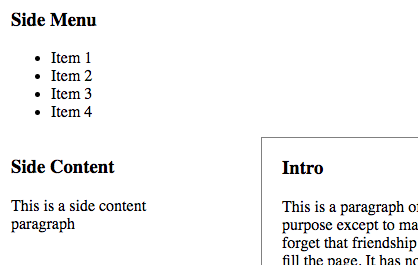
Open
selectors.htmland move the side contentsectionso that it is defined below the#main_content -
In general, an HTML document should define content in order of
importance from top to bottom.
In this case, the side menu might link to other pages, so consider it
more important than the
#main_content. But the.side_contentsection is less important than the#main_content, so it should be defined afterwards in the HTML document. -
Use CSS to create the 3-column layout shown below but only if the browser's width is 1000px or greater:
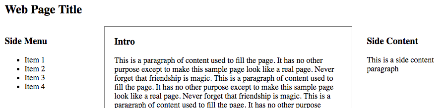
Hints:- Use the existing
@mediacode as an example. Copy and paste it to create a new media query that does the following: - If the
min-widthis 1000px, then... - Make the
#containerwidth 950px - Make
.side_contentfloat left and set clear to none - Make
#main_contentfloat left - Give the
section.side_contentleft margin of 30px, so it is not close to the#main_content. Note that you do not want to add left margin to all.side_contentelements just the side content section, i.e.,section.side_content. Note that the selector does not have a space.
- Use the existing
- By defining the side menu, main content and side content in order of importance, we can float these elements to the left to create a 3-column layout where the most important elements are on the left and the least important are on the right. Alternatively, we can float these elements to the right to reverse the horizontal ordering.
-
Notice that the conclusion
sectionandfootertouch each other even though thefooterhas top margin. This is because the#main_contentfloats left and floating elements can occupy the margin of block elements such as headers and footers. -
To fix this, add 30px of bottom margin to
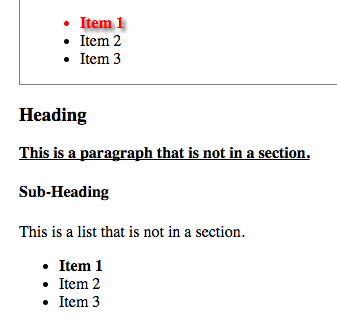
#main_content. Block elements will "respect" the margin of floating elements. - Notice that we use a "special" class and a "unique" id to identify list items. These can be used to apply style to specific elements.
- Use CSS to make the "special" class have bold text no matter where it is used.
-
Use CSS to make the "special" class have underlined text but only if
the element itself is a paragraph, i.e.,
ptag. Hint: the selectorp .specialhas a space in it, so it is really specifying two elements, apand an element with the class namespecial. If you leave out the space, i.e.p.special, you are specifying one element, i.e., a paragraph with class namespecial. -
Use CSS to make the "special" class have red text but only if
the element is inside of a
sectionelement. - Use CSS to make the "unique" id have a text-shadow that is gray with a blur radius of 5px and a vertical/horizontal position of 3px 3px.
-
The website should now look like this:
TASK CHECK
Verify that your CSS code, i.e., selectors.css validates at:
jigsaw.w3.org/css-validator
Then, show your instructor your completed valid document.
Note that the website should have a responsive three column design.
When the browser is 1000px wide or greater, there should be three columns.
When the browser is less than 800px wide, there should be one column.
Otherwise, there should be two columns.
2. HTML Forms
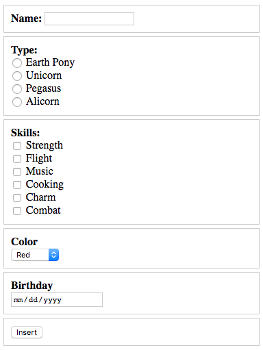
-
Open
form_basic.htmlin Notepad++ and alter it so that it looks like this:
- Refer to zyBook Chapters 2.2-2.4 for help.
-
Add two additional radio buttons for
pony_type, specifically with the values and labels "Pegasus" and "Alicorn" -
Be sure to give the new radio buttons unique
id's that match theforattribute in the corresponding labels - For more information about how to properly define labels, see this link developer.mozilla.org/label
-
Add four additional checkboxes for
skill[]. Use values and labels of your choosing. For instance, ponies could have ninja skills such as "Nunchaka" and "Kenjutsu" -
Be sure to give the new checkboxes unique
id's that match theforattribute in the corresponding labels - Note that the name of the checkboxes includes an array bracket []. This enables the checked values to be passed in an array instead of independently
-
Re-read the section on the
selecttag (drop-down menu) in zyBook Chapter 2.3 and look at this example -
Add
selecttag with both anameandidof "pony_color" -
Nested inside the
selecttag, add at least 5 color options. Be sure to specify both the value and the visible content inside theoptiontag. -
Note that the
selecttag should have both anidandnameattribute, but theoptiontags should only havevalueattributes, i.e.,value = "red" -
Re-read the section on the date picker tag, i.e.,
input type="date"in zyBook Chapter 2.4. -
Add a date picker
inputtag with anameandidof "pony_birthday" -
Add CSS inside of a
styletag to decorate thedivandlabeltags. -
Add CSS to make the
labeltags bold, but only the first label tag in eachdivtag. Read about the nth-child selector if you forgot how you can select only the first child
div tag should
have a 1px solid gray border and both padding and margin to add better spacing.
Why does a form element need both a name and an id?
name attribute
The name attribute is very important because the HTTP protocol
uses it to identify submitted values. When a form is submitted,
an HTTP request is made and all the values that are entered or selected
in the form are sent in an associative array. The names are used as the array indices
so that server-side scripts can "get" the submitted values by name. If
your names are not 100% correct, server-side scripts will fail.
The convention for names is to use all lowercase letters and to never use spaces.
Use underscores _ instead of spaces.
id attribute
The id attribute is also important because it is used
by JavaScript to uniquely identify elements. It is common to
use JavaScript to make sure a form is correctly filled out (called "form validation")
before submitting the value in an HTTP request.
The id of each form element can also be "connected" to the corresponding
label tag. JavaScript can be used to highlight the label
for elements that are blank or not filled out correctly. We will learn how
to do this when we study JavaScript in two weeks.
VERIFY before sumbitting
Verify that your HTML code, i.e., basic_form.html validates at:
html5.validator.nu
Then, try submitting your form with real values. If you named
all the element according to the instructions, a server-side script called
insert_pony.php will display the form values as
an associative array, then each individual value will be display and finally
the script could insert the data into a database but this feature
has been disabled since this script is not yet secured.
DELIVERABLE
Create a zip file of your lab2 folder called lab2.zip
and submit the file in Blackboard. The zip file should contain three files:
selectors.html, selectors.css and basic_form.html.
In the comment area of Blackboard put your partner's name.
Not finished?
The deliverable must be submitted in Blackboard by midnight on the day before your next scheduled lab meeting. If you wish to work alone, you can submit the deliverable yourself. However, you are encouraged to work with your partner and you can submit together. When submitting as a lab pair, be sure to include your partner's name in the comment area when you submit via Blackboard.
Do not share
Outside of lab, you are only permitted to work with your lab partner. Do not share your work with any other student.